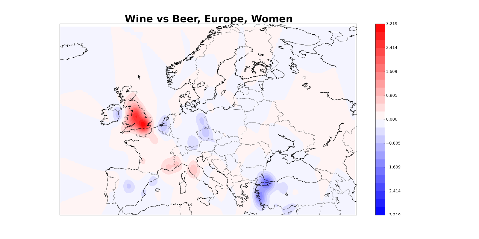
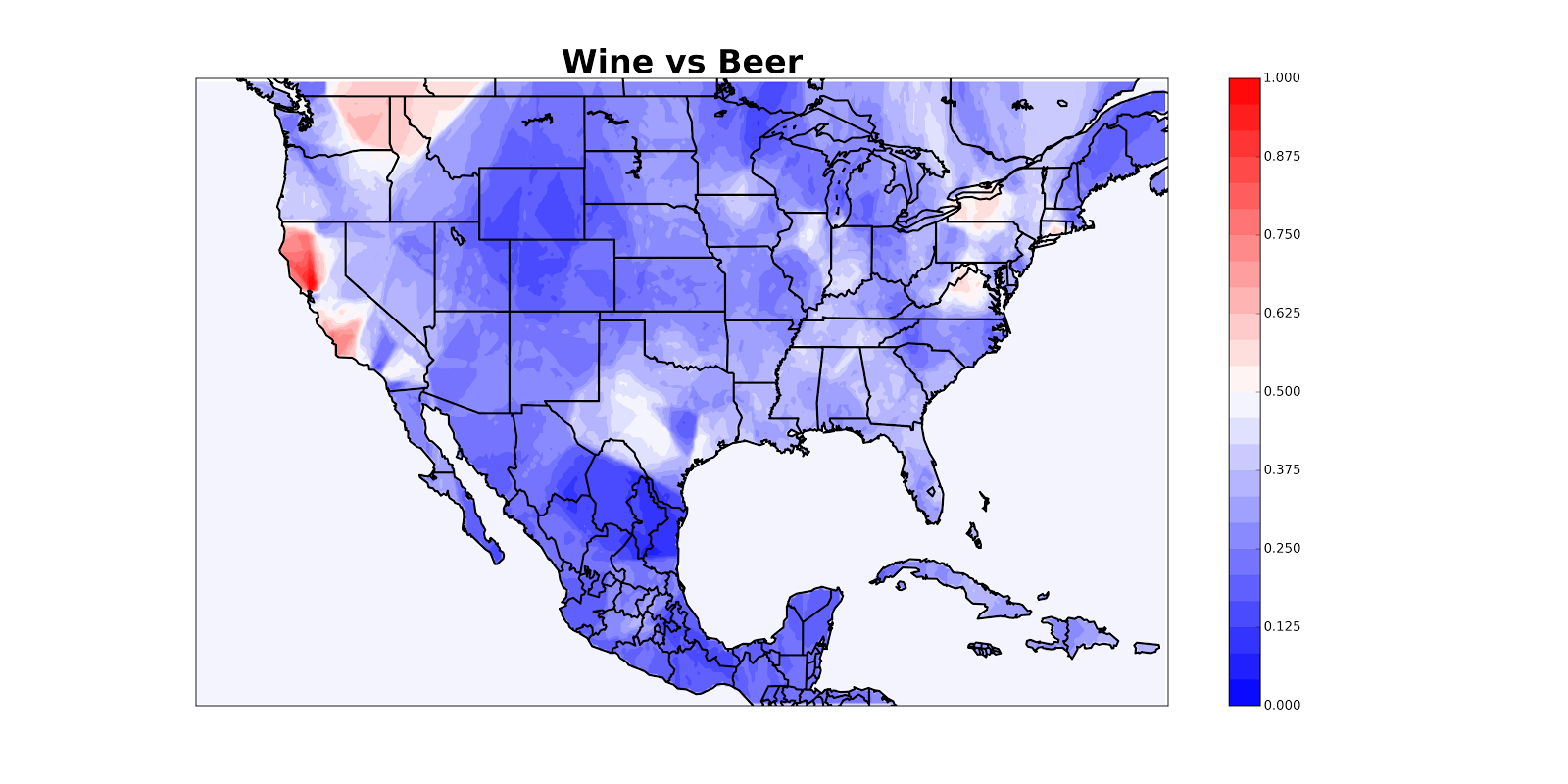
How do we map the density of a set of events? For example, we might want to map locations of tweets supporting Bernie Sanders as opposed to Hillary Clinton or locations of housing evictions or locations of police shootings. I confronted this problem recently while writing a post for Quartz (which they split into two) about where people tweet more about wine and where they tweet more about beer. Here’s a finished map (you can see more in the Quartz posts); color shows the fraction of #beer or #wine tweets which are about #wine, with red denoting pro-#wine areas.

I built a tool which lets you make maps like this, and because I think this problem is often useful to solve and often solved badly, I provide some thoughts on how to make maps below. If you’re not interested in details, you should probably just look at the maps in the Quartz posts, but if you keep reading you’ll at least get to see me make a lot of bad maps.
One simple thing to do is just to make a state-by-state map where each state’s color corresponds to the density of events. This has a few problems. It requires us to map all the latitude, longitude pairs to their states, and if we want to look a country besides America, we need to adapt our method; more fundamentally, it’s not very high-resolution, and there are often interesting patterns at the sub-state level.
To get better resolution, people often just plot the exact latitude, longitude location of the tweets, so you get visualizations that look like this:
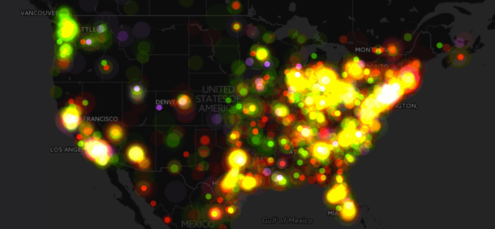
Which is pretty but not very useful (like your momma!) because it basically just shows us where the cities are. (I have lost track of the number of data analyses I have read that can be summarized as, “when you have more people, more things happen”).
What I think you usually want to do is plot the density of events relative to some background. For example, I don’t care about the absolute density of wine tweets, which will be heavily correlated with population density; I care about the fraction of beer/wine tweets which are wine tweets.
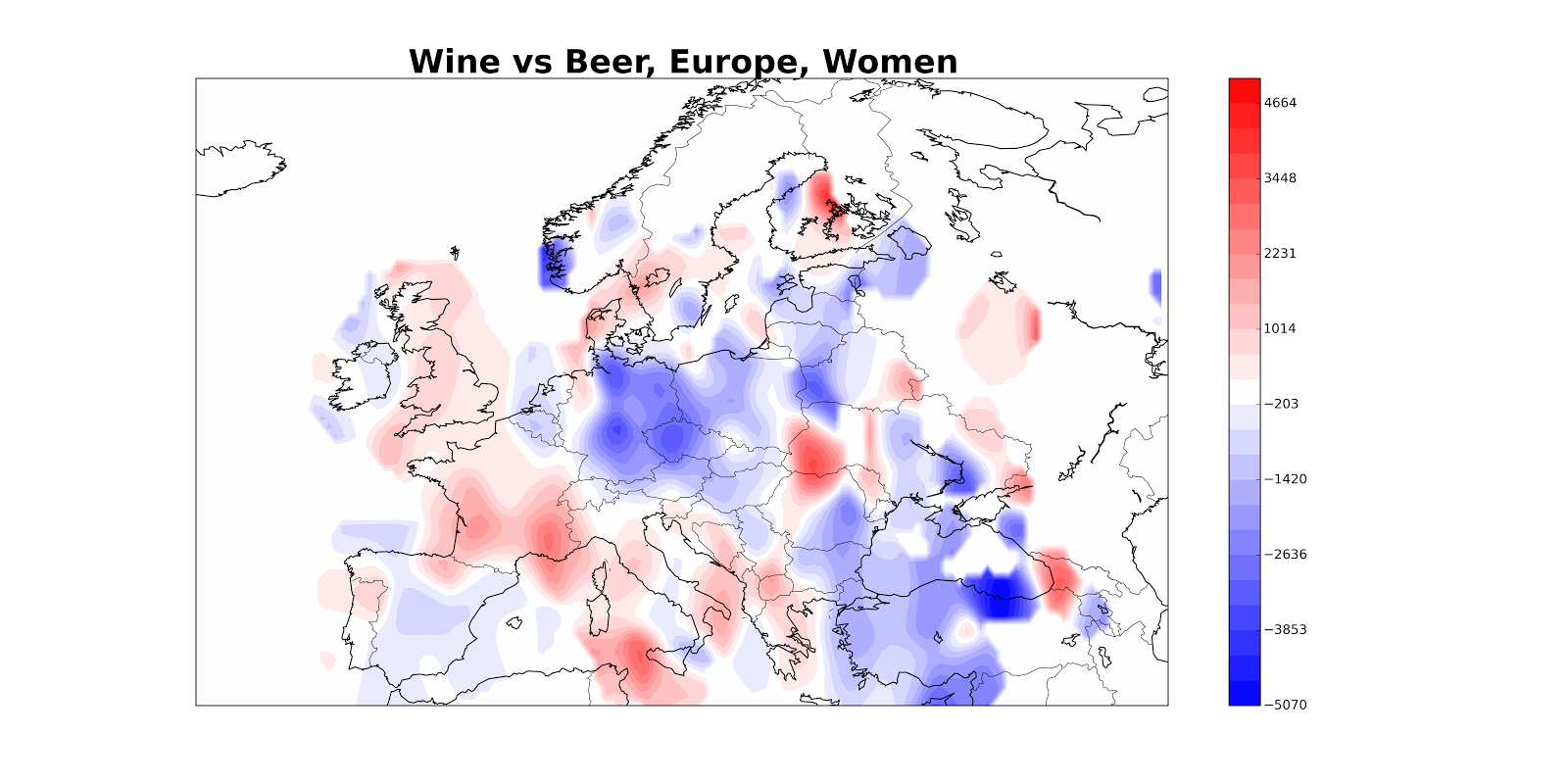
So one thing we can do is estimate the density of wine tweets, estimate the density of beer tweets and then plot the difference: densitywine - densitybeer. (We can estimate density using a method called, appropriately, kernel density estimation). Here’s what happens when we do that; red denotes areas with more wine, blue with more beer.
The problem is that the reddest areas aren’t necessarily the areas where 90% of people are tweeting about wine; they might also just be the areas with a ton of tweeters (which will also have larger differences between densitywine and densitybeer). So maybe we really want something like densitywine / (densitybeer + densitywine), which we can interpret as the fraction of tweets which are about wine. Here’s what that looks like.
The problem, basically, is that the ratio of two things is unstable when the denominator gets small, which often happens. I tried various ways of getting around this but they were finicky.
So here’s an alternate solution: for every point which you want to color, look at the closest 10 beer/wine tweets and see how many of them are about beer. It seems like this will take a really long time if we have, say, 10,000 points and 50,000 tweets. Luckily, computer scientists have devised an efficient way of doing this which takes about two lines of code and a second to run (#MyFieldIsCoolerThanYourField) [1].
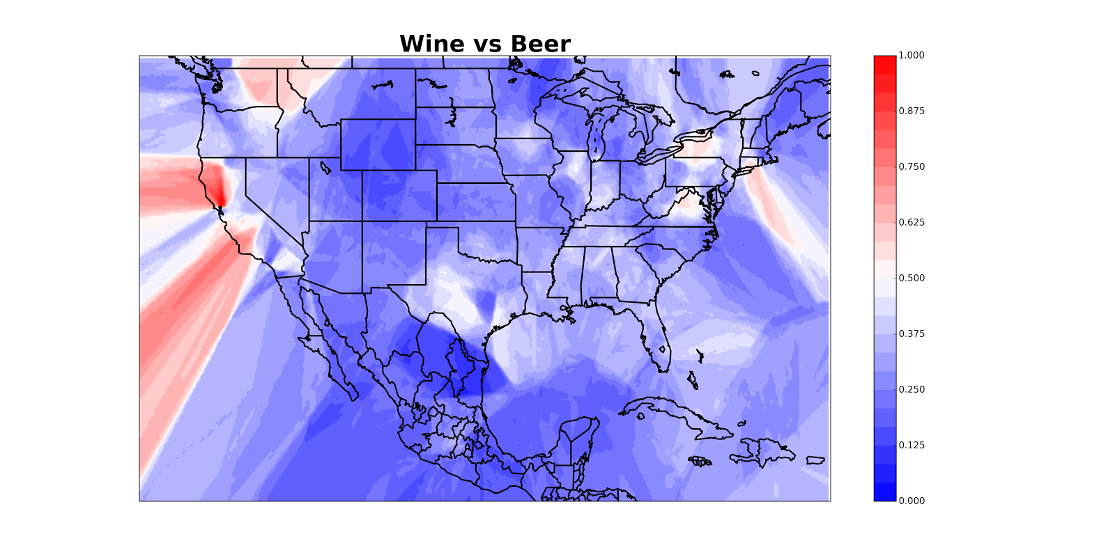
This doesn’t look so good because California appears to be hemorrhaging, but once we mask off the oceans we get a nice map:
I’ve posted the code to make maps like these on GitHub so you can make maps of your own (and let me know if you find anything cool)! Keep in mind that the map will be less reliable in areas with little data. You can use it on any data (not just from Twitter) that has latitude and longitude. It requires knowledge of Python, so shoot me an email if you get stuck. If I get enough complaints from people who want to make maps but can’t use Python, I’ll just build a web tool.
Also, I am not a mapmaking expert, so feel free to tell me how I could’ve used CartoDB or whatever to do all this! (My problem with CartoDB is that the free version won’t keep data private and limits the size of your datasets to 50 MB. I’m not really a 50 MB kind of girl.)
Notes:
[1] We just train a k-nearest neighbors classifier and plot its classification surface. There’s also the question of how you choose the number of nearest neighbors to look at. If you choose too small a number, the map gets very splotchy:
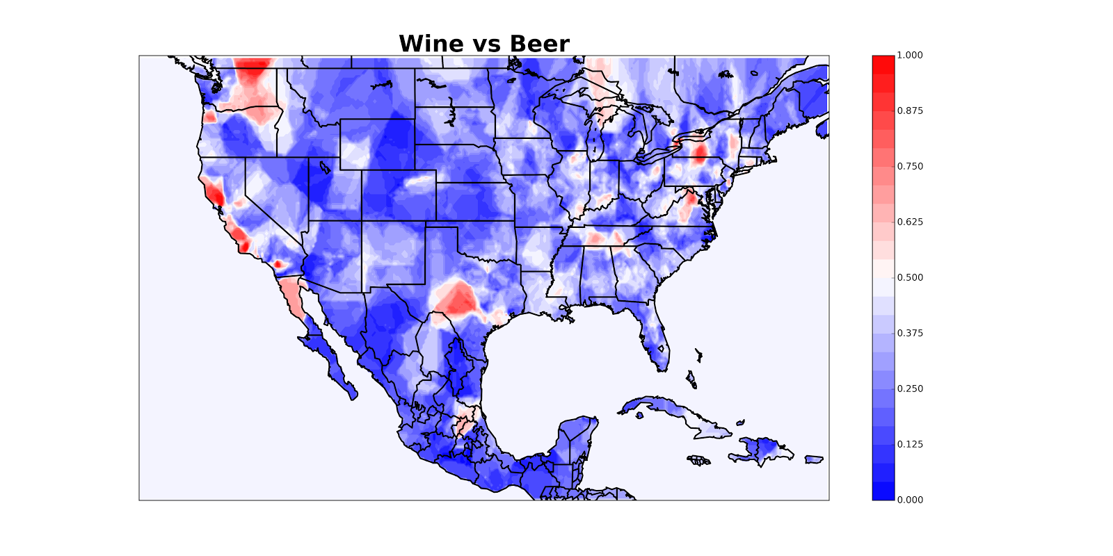
And if you choose too large a number, you lose real details. I’m not exactly sure how best to choose, so hit me up if you have thoughts. Do not tell me to use cross-validation. Seriously, we’re mapping drunk tweets here.
A final note: this tool obviously relies on you having latitude / longitude data. Many datasets are not in this form (eg, they might include addresses instead) and I have not found a great way to rapidly convert between addresses and latitudes / longitudes, because many APIs are rate limited. Let me know if you have a good solution to this problem.