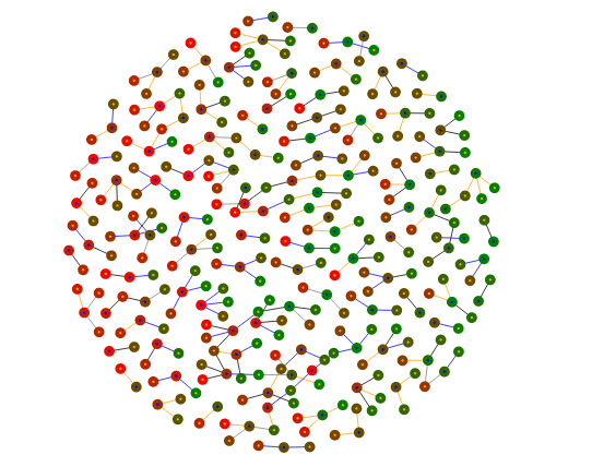
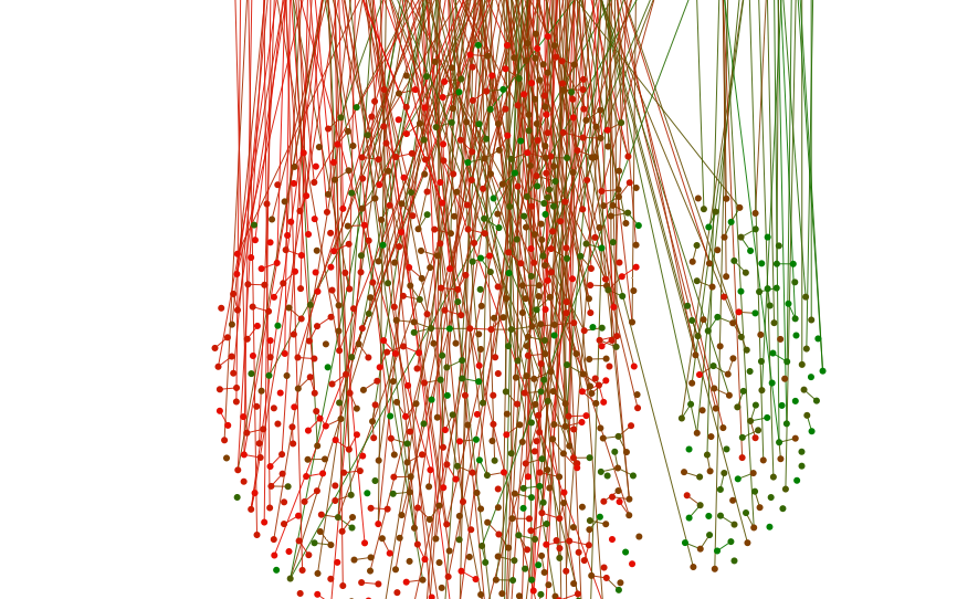
As a followup to the FiveThirtyEight piece, you can find some visualizations of eHarmony couples here. Each circle represents a person on eHarmony, colored according to their value of a trait; two circles are linked if eHarmony’s algorithm matched them together. As the visualization makes clear, similar-colored circles tend to be linked: birds of a feather flock together. Here’s attractiveness, for example; the green ones are the hotties, and they mostly stay on the right, away from the less attractive red people. (This is not a normative comment on skin color. I do not know any green or red people.)
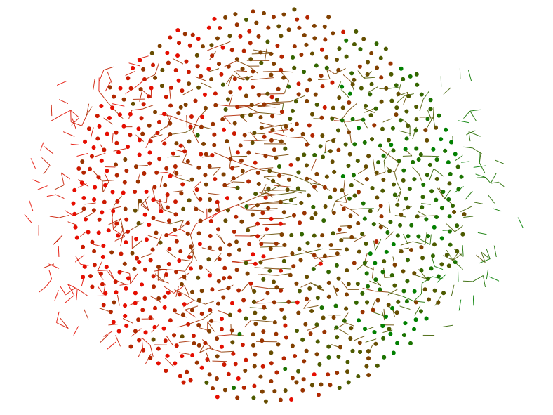
While I was making this, using a language called d3, I took a bunch of screenshots of my progress, which I’ll present as a lesson in failing repeatedly. I started with code to create a visualization with linked circles. But the circles weren’t naturally sorted by color, so the “birds of a feather” phenomenon wasn’t visually obvious, which was the whole point. So I decided I would program in a force that pulled green circles one way and red circles another. This was my first attempt:
And I realized I had forgotten to turn on the force for the red circles. When I did that, I got:
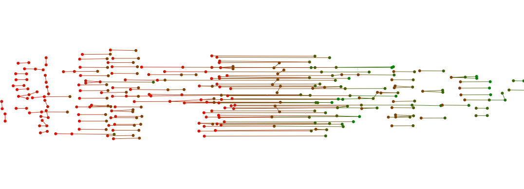
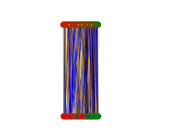
which was a little too Romeo and Juliety: the two factions couldn’t stand each other. So I added exponential decay to the force, so it’d be initially strong (and sort the circles) and then disappear (so they didn’t flee to opposite sides of the frame). Then I decided I wanted to make links appear and disappear when you clicked, depending on who asked out whom. Unfortunately, my first attempt to make links disappear left the old ones lying around like bits of hair:
And, because I don’t really understand d3, I couldn’t figure out how to make the links go away. But I could figure out how to change which nodes they linked to, so I made most of them link to a single node:
which looked more like a dystopian council meeting, or maybe a very strange stoplight, than anything I wanted. But then I figured out how to make the nodes link to the ceiling:
which again wasn’t what I wanted, but allowed me to get what I did: I made all the links start and end in the corner, which effectively made them disappear. I added a little force pulse when you clicked to reorganize the nodes, and you can see the final product here.
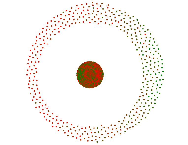
I’m still not completely happy with this, because while it’s pretty, it doesn’t tell you much besides “birds of a feather flock together”. It’s also very hard to tell the difference between girls and guys, and therefore to draw any conclusions about sex differences. Sarah Sterman suggested visually emphasizing sex differences by putting men on one side and women on the other. At first they got too snuggly, making a giant column-o’-love:
I tried putting them into concentric circles, but that led to weird boundary conditions, so I bumped up the charge to keep them away from each other, and that was a little better:
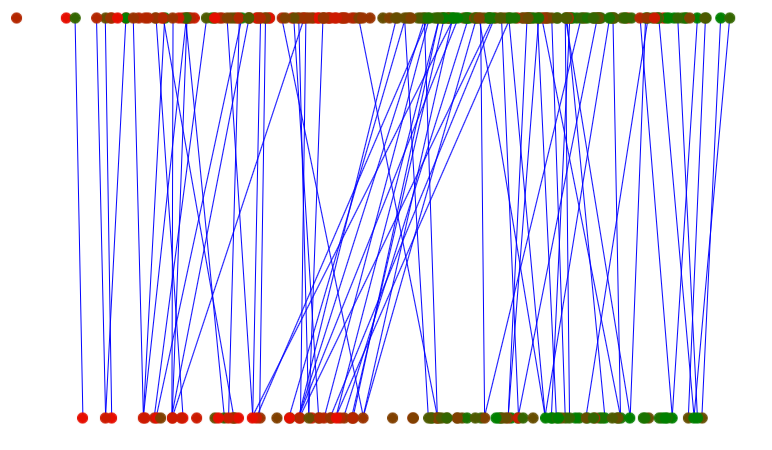
Women are on top, men on bottom: the blue lines indicate cases where the man asked out the woman but she didn’t reciprocate. This visualization is actually more informative than the circle version, because the lines pointing to the right show us that less attractive men get rejected by more attractive women. I think I prefer the bipartite version, but it’s currently a little buggy and a little ugly, so I’m working on it.
My point in telling this story, besides that I suck at d3, is that I think it’s pretty hard to do science or statistics unless you enjoy working with things that are broken, and working with them quite ineptly. I don’t think it’s enough merely to take pleasure in a working product, because 98% of the time I don’t have one. You have to enjoy the careful, painful process of working through the bugs, and be gentle with yourself while you do it -- sleep when you’re tired, don’t beat yourself up over mistakes, have faith in your talent. Here, I’ll make a reference that’s exclusionary towards men -- see how you like it -- it’s like combing long, messy hair: working through the tangles, taking your time, not tearing your hair out.
This isn't unique to science. My mother is an artist, and wakes up at 5 so she can paint eight hours a day -- which I find highly admirable in the abstract but less so when I’m actually sitting for a painting and she won’t let me leave after three hours because my “eyebrow is all wrong”. I’m also not saying that you should be ecstatic every moment you spend debugging, or that you can never lose your temper. One of my coworkers stopped me while I was yelling profanity at my computer yesterday -- I didn’t notice because I had headphones in. Apparently, I curse so frequently that I do it without thinking.
We so often present only our final products: we conceal the cracks and the scaffolding, the blind alleys we ran down. This not only makes us neurotic, in the same way that seeing only everyone’s engagement photos on Facebook makes us lonely -- it also leads to bad science. If you want your scientific story to be too perfect, you’ll conceal the “flaws” that make it true; if you hide the many statistical tests you did to find the few that are significant, you’ll report results that are spurious. I will write more about this later, but in service of keeping things short, I’ll just close with a song about loving imperfections:
'Cause all of me
Loves all of you
Love your curves and all your edges
All your perfect imperfections...
You're judging me. Whatever.
Thanks to Sarah Sterman, Nat Roth, and Maria Mateen.
Note: Unfortunately, the eHarmony data contains no same-sex couples because they do not match same-sex couples on eHarmony's main site; I am looking into ways to get a dataset for same-sex couples as well (for what is currently known, see the original piece.)
Note: Unfortunately, the eHarmony data contains no same-sex couples because they do not match same-sex couples on eHarmony's main site; I am looking into ways to get a dataset for same-sex couples as well (for what is currently known, see the original piece.)