Whenever I got too cocky as a child, my mother used to threaten me with “regression to the mean”.
“You think you’re so smart,” she would say. “But statistically, smart parents tend to have children who are dumber than they are. So you’d better listen to me.”
Clearly this was scarring, because I then went to college and took a bunch of statistics classes in an effort to understand this fearsome “regression to the mean”. It turned out to be a foe as subtle as it was important: a recent article in Nature cited it as one of the 20 most critical phenomena for policy-makers to understand. I will first explain the concept, and then two particularly seductive perversions of it [1]. It is entirely possible that my understanding is still flawed, in which case you should comment or shoot me an email.
What is regression to the mean?
My mother was right: exceptional parents tend to have less exceptional children. Sir Francis Galton was first to notice that tall parents tended to have children who were shorter than they were, and short parents tended to have children who were taller. This isn’t just an effect with parents and children. Mutual funds that do very well one year tend to do worse the next year. If we look at the 100 National Basketball Association players who scored the most points in 2012, 64% of them scored fewer points in 2013. And this is true no matter what metric we look at:
If we rank players by...
|
Probability a top-100 player got worse in 2013:
|
Defensive rebounds per game
|
64%
|
3-pointers per game
|
63%
|
Assists per game
|
59%
|
Steals per game
|
67%
|
Doing well in 2012 isn’t causing the athletes to do worse in 2013: as I’ll explain, this is merely a statistical illusion. So regression to the mean inspires a lot of really stupid sports articles: the Sports Illustrated cover jinx refers to the myth that appearing on the front cover of Sports Illustrated is bad luck for an athlete because these athletes often suffer a drop in performance, but this is only a manifestation of regression to the mean, not a causal effect of the cover story. Medical trials provide a slightly more consequential example: if you give a drug to people in the midst of severe depression and check on them two weeks later, they’ll usually be doing somewhat better, but that’s not necessarily the causal effect of your drug: they would also probably have improved if you had done nothing.
Why does this occur?
Scoring baskets is a combination of skill and luck. A basketball player who scores an exceptional number of baskets in 2012 is likely more skillful than the average player, but he’s also likely more lucky. His skill will persist from season to season, but his luck won’t, so if he got very lucky in 2012, he’s likely to be less lucky--and do worse--in 2013. Regression to the mean emerges whenever we have this combination of signal and randomness: the signal will persist, but the randomness will not.
Scoring baskets is a combination of skill and luck. A basketball player who scores an exceptional number of baskets in 2012 is likely more skillful than the average player, but he’s also likely more lucky. His skill will persist from season to season, but his luck won’t, so if he got very lucky in 2012, he’s likely to be less lucky--and do worse--in 2013. Regression to the mean emerges whenever we have this combination of signal and randomness: the signal will persist, but the randomness will not.
We can describe this combination of signal and randomness more mathematically. Regression to the mean occurs whenever there is imperfect correlation between two variables: they don’t lie along a perfectly straight line (see end for a longer explanation of correlation [2]). Here are some correlations:
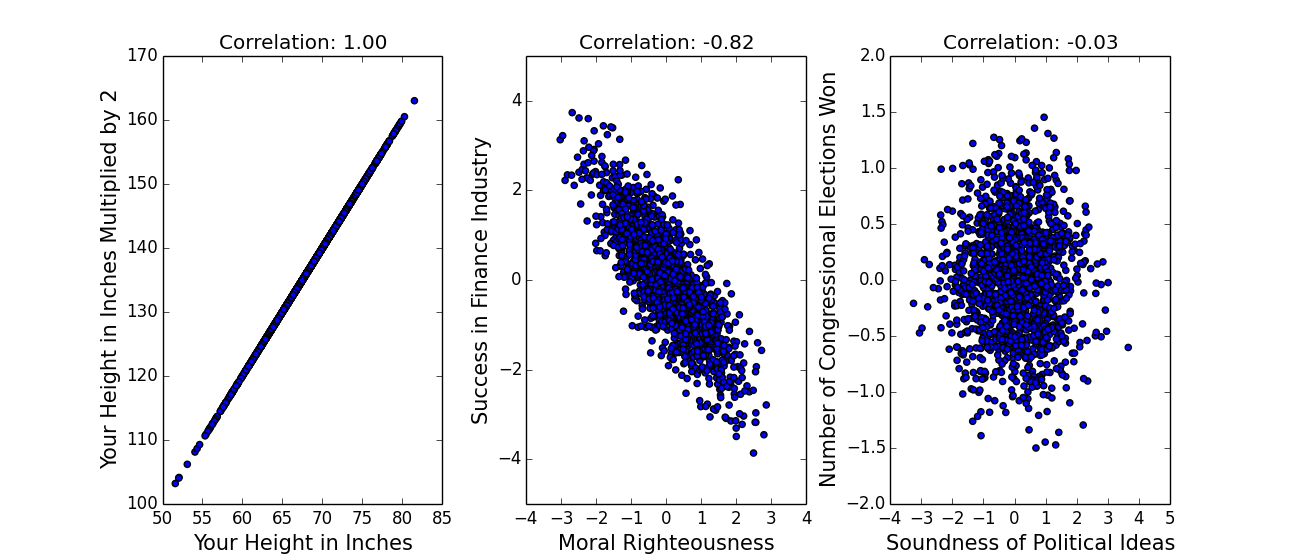
(The above data is hypothetical.) Perfect correlations, of -1 or 1, are pretty much impossible in real data, which means that almost any two variables will exhibit regression to the mean. Let x be how good-looking you are and y be how many drinks you get bought at a bar. We'll express x and y in terms of standard deviations--so if you were two standard deviations better looking than the average person (like me, on a bad day), x would be two. (We often refer to data not in terms of its actual value, but in terms of its distance from the average in standard deviations, because that gives us a sense of how rare it is: this is sometimes called z-scoring, see end for a brief explanation [3]).
x and y are probably positively correlated here [4]--let’s say the correlation r is .5. If you want to fit a straight line to the data--we call that “linear regression” or “the only technique an economist knows”--predicting y from x is actually incredibly simple: y=r*x [5]. (This is only true because x and y are z-scored -- another nice thing about z-scoring data -- in general, the formula is a bit more complex.) So if you were two standard deviations better looking than the average person, r being .5, linear regression would predict that you get one standard deviation more drinks than the average person. The important point here is that two is less than one: the number of drinks you get is less extreme than your hotness, you have regressed to the mean.
Because the gap between x and r*x gets bigger as x gets more extreme, the gap between x and our predicted value of y gets bigger as x gets more extreme--more regression to the mean. (On the other hand, if x is close to its mean, the scatter in y means that y will actually tend to lie farther from the mean than x does: very average parents should have more extraordinary children, which we could maybe call the Dursley-Harry Potter effect.)
This definition makes regression to the mean both more and and less powerful than is often supposed, which brings me to...
The two seductive misconceptions
The two seductive misconceptions
1. Because the examples given of regression to the mean are often of parents and children, many people think it has something to do with genetics and biology; alternately, they hear about depressed people becoming better on second measurement and think it is just a property of repeated measurements. But regression to the mean has nothing to do with sex or psych or any of those icky things: it is a mathematical property of any two imperfectly correlated variables, and there need be no causal relationship between the two.
2. The second seductive misconception is my favorite, because it means my mom was only half right. Regression to the mean is limited in two important ways which I’ll illustrate by example. First, regression assumes our data lies along a straight line. But consider the case where x describes the performance of a royal courtier on his first etiquette exam, and y describes the performance on his second. We might expect to see something like the left plot, where a straight line fits the data well. Now imagine the exam proctor is Henry VIII, so that between the first exam and the second, every courtier who’s below average is beheaded, and every courtier who’s above average is given the answer sheet. In that case, everyone either gets a perfect score or a zero (right plot), and a straight line no longer fits the data very well. (Both plots are z-scored so the mean is zero and the standard deviation is 1.)
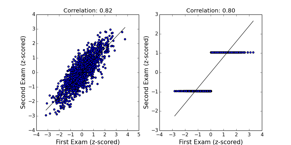
Even though both datasets have roughly the same correlation, and thus the same degree of “regression to the mean”, these concepts are only meaningful to the extent that a straight line actually fits the data. Intuitively, in the second plot, the y-values are more extreme than the x-values: certainly the headless courtiers would think so.
But let’s ignore this problem and assume that a straight line does fit the data well. All that means is that y is fewer standard deviations from the mean than is x. But if the standard deviation of y is much greater than that of x, the predicted values of y may still be “more extreme” in an absolute sense, even if they’re not in a z-scored one. Below I calculate the average score of state Congressional representatives on a conservative-liberal scale, according to these bros, for the 97th Congress (beginning in 1981) and the 111th Congress (beginning in 2009). Negative is more liberal.
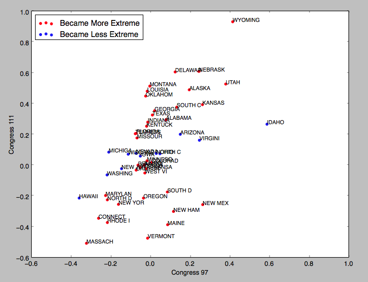
Unsurprisingly, there’s a strong correlation, with r=.57. But this correlation is still less than 1, so we would expect this dataset to exhibit regression to the mean, and indeed it does: when we look at the 10 most extreme liberal states in 1981, 7 become less liberal (as measured by z-score) in 2009 (the exceptions are Massachusetts, Rhode Island, and New York). But our incredibly harmonious political system has become more polarized since the 1980s, and so the standard deviation in y is nearly 50% greater than the standard deviation in x. So while this dataset technically exhibits regression to the mean (in the z-scored sense), 38 of the 50 states are actually farther from the mean, in an absolute sense, in 2009 than they were in 1981: they became more extreme (red dots) not less extreme (blue dots). And since x and y are measured on the same scale, we probably care about the absolute sense.
Mind blown! In summary: if the scatter in your data increases, regression to the mean might not mean much. To return to my argument with my mother, one might imagine that smart parents make their children play chess, and dumb parents make their children play football, and that chess and football have such profoundly opposite effects on intelligence that the children’s IQs range from 50 to 150 while their parents’ range only from 90 to 110. The z-scored predictions for the children’s IQs will be less extreme than their parents’, but the absolute predictions may be much more extreme.
Which is to say that my mother is not necessarily right. But given that I’ve spent the last 17 years worrying about an argument she’s long since forgotten, you can draw your own conclusions [6].
With thanks to Shengwu Li and Nat Roth for insights.
Notes:
[1] My high school physics teacher used to shield us from tempting mistakes by saying “Don't give in to this seduction! Because then you'll be pregnant with bad ideas.”
[2] Correlation is a number between -1 and 1 which measures how consistently an increase in one variable is associated with an increase in the other. Positive correlations indicate that an increase in one variable corresponds to an increase in the other; negative correlations indicate that an increase in one variable corresponds to a decrease in the other; zero correlation indicates no relationship.
[4] Except at really sad places like MIT bars, where there’s so little variation in x that the correlation coefficient becomes undefined.
[5] For those who know a little bit about regression, here’s the weird thing you might want to think about: we could also predict x from y, in which case we get x=ry, not y=rx. Which of these lines is “correct” and why is this not a contradiction?
[6] In case it is not apparent, I like my mother.